


Support this project with a ⭐ -report an issue, or even better, place a pull request 📫 😊
My projects Edi, Aehnlich, and many others (open source or commercial) are powered by this project.
AvalonDock is a WPF Document and Tool Window layout container that is used to arrange documents and tool windows in similar ways than many well known IDEs, such as, Eclipse, Visual Studio, PhotoShop and so forth.
This repository contains additional bug fixes and a feature added fork for: xceedsoftware/wpftoolkit version 3.2-3.6. Version 4.0 and later are developed independently, which is why this library (version 4.0 and later) uses the namespaces and library names that were used in AvalonDock 2.0 and earlier versions. But most importantly, the usage of this AvalonDock project remains free for both, commercial and open source users.
There is also an open source repository https://github.com/dotnetprojects/WpfExtendedToolkit with a fixed and stable version of all other (other than AvalonDock) components from the WPFToolKit.
Be sure to checkout the Wiki for more details.
This project targets .NET 9, .NET 10, and .NET Framework 4.8. You need:
- Windows (WPF is Windows-only)
- Visual Studio 2022 or later (recommended)
dotnet build source/AvalonDock.sln
dotnet test source/AvalonDock.sln -m:1
See CONTRIBUTING.md for more details.
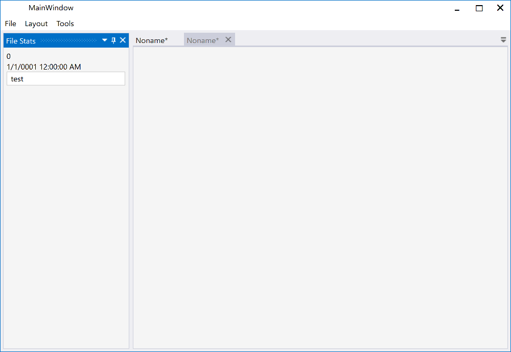
AvalonDock includes several modern themes out of the box:
Modern theme with compact tabs, rounded corners, and semi-transparent design elements. Inspired by contemporary IDEs with minimal spacing and clean aesthetics.
Dark Mode:
using AvalonDock.Themes;

dockManager.Theme = new ArcDarkTheme();
Light Mode:
dockManager.Theme = new ArcLightTheme();Classic Visual Studio 2013 look with Dark, Light, and Blue variants.
dockManager.Theme = new Vs2013DarkTheme();
// or
dockManager.Theme = new Vs2013LightTheme();
// or
dockManager.Theme = new Vs2013BlueTheme();- VS2010 - Visual Studio 2010 style
- Expression Dark/Light - Expression Blend inspired
- Metro - Modern Metro/WinUI style
- Aero - Classic Windows Aero theme
You can also load just the brush resources in your resource dictionary:
<ResourceDictionary.MergedDictionaries>
    <ResourceDictionary Source="/AvalonDock.Themes.Arc;component/DarkBrushs.xaml" />
</ResourceDictionary.MergedDictionaries>
These definitions do not theme all controls used within this library. You should use a standard theming library, such as:
- MahApps.Metro,
- MLib, or
- MUI
to also theme standard elements, such as, button and textblock etc.
Please review the Project Wiki to see demo screenshots.
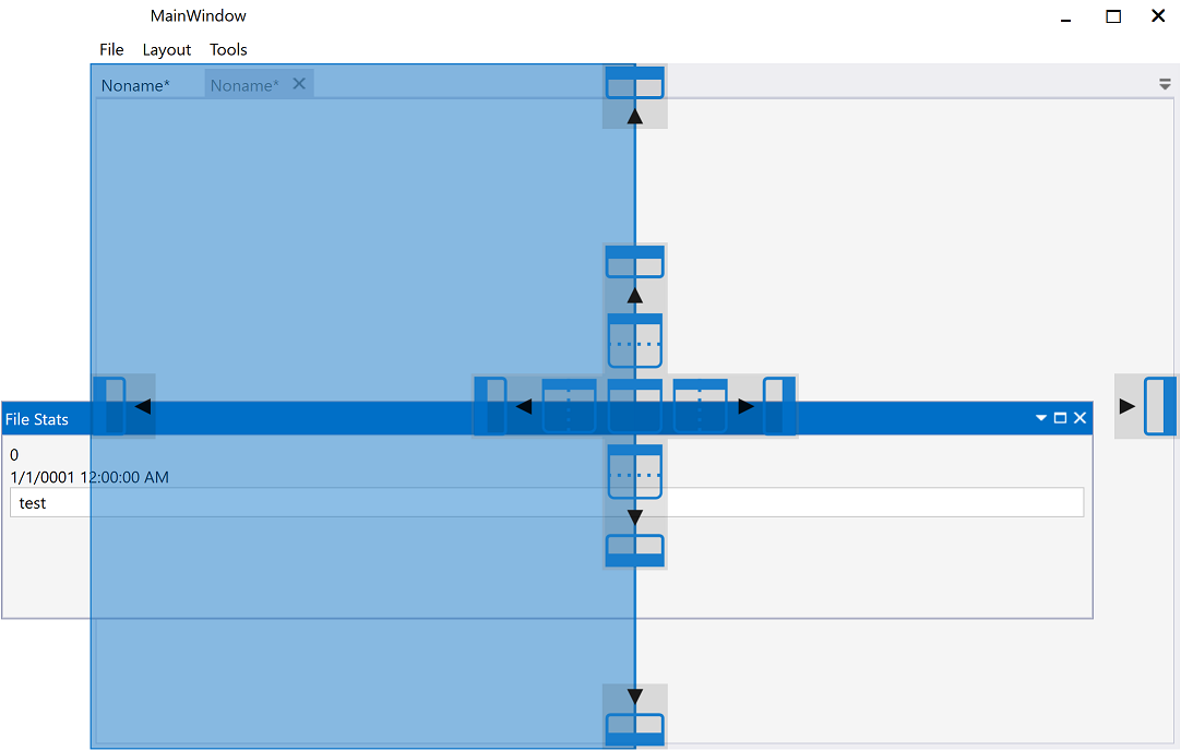
The Docking Buttons are defined in XAML, which ensures a good looking image on all resolutions, even 4K or 8K, and enables us to color theme consistently.
| Description | Dark | Light |
| Dock Document | 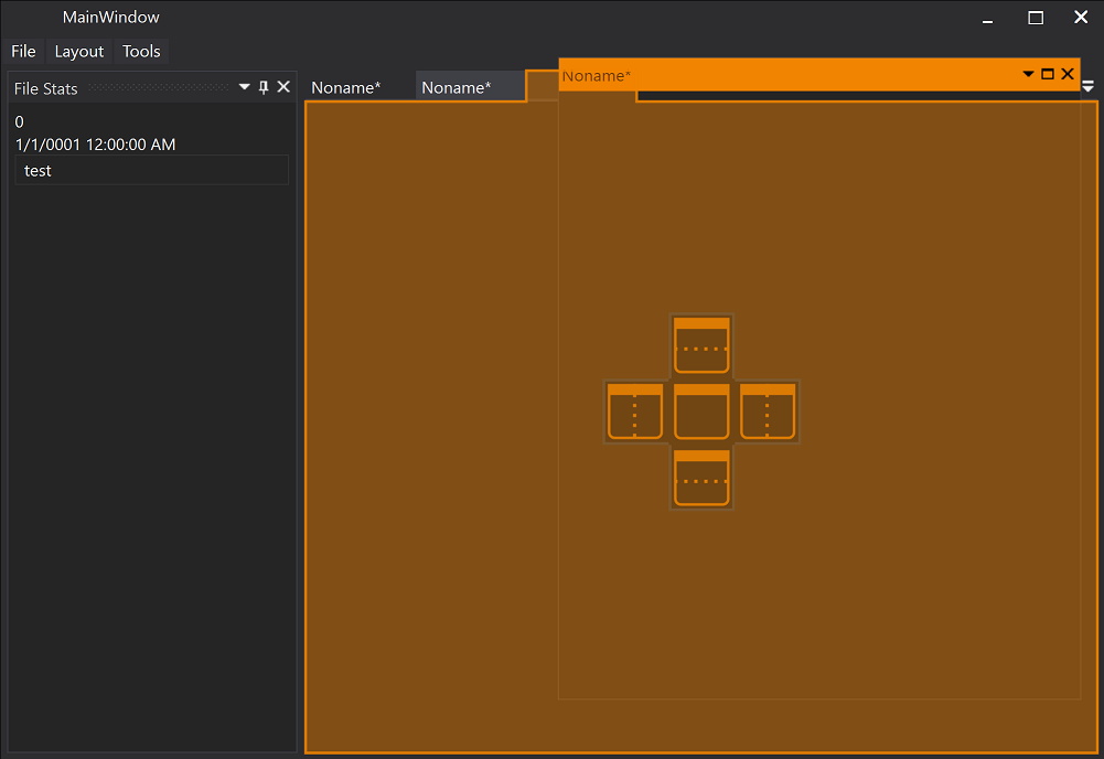 |
 |
| Dock Document | 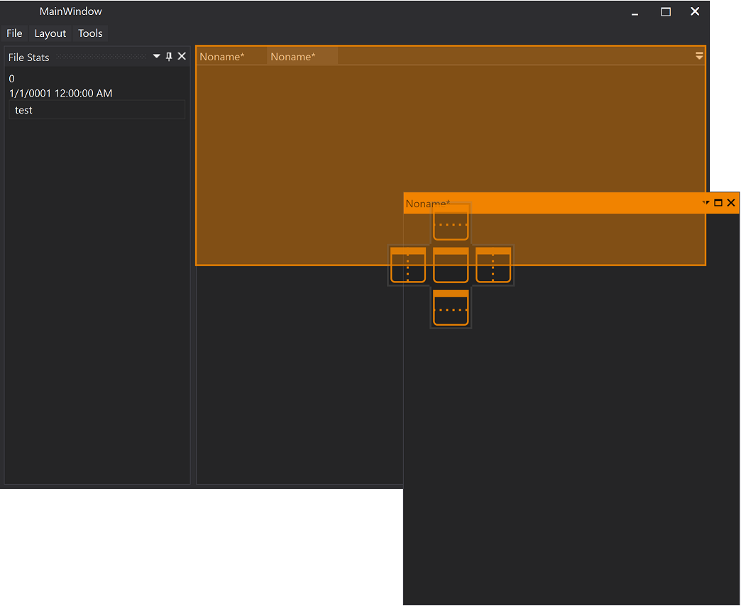 |
 |
| Dock Tool Window | 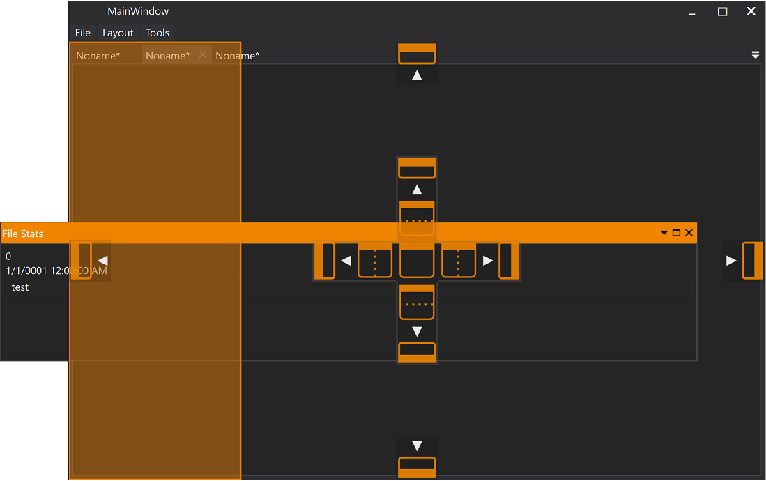 |
 |
| Document | 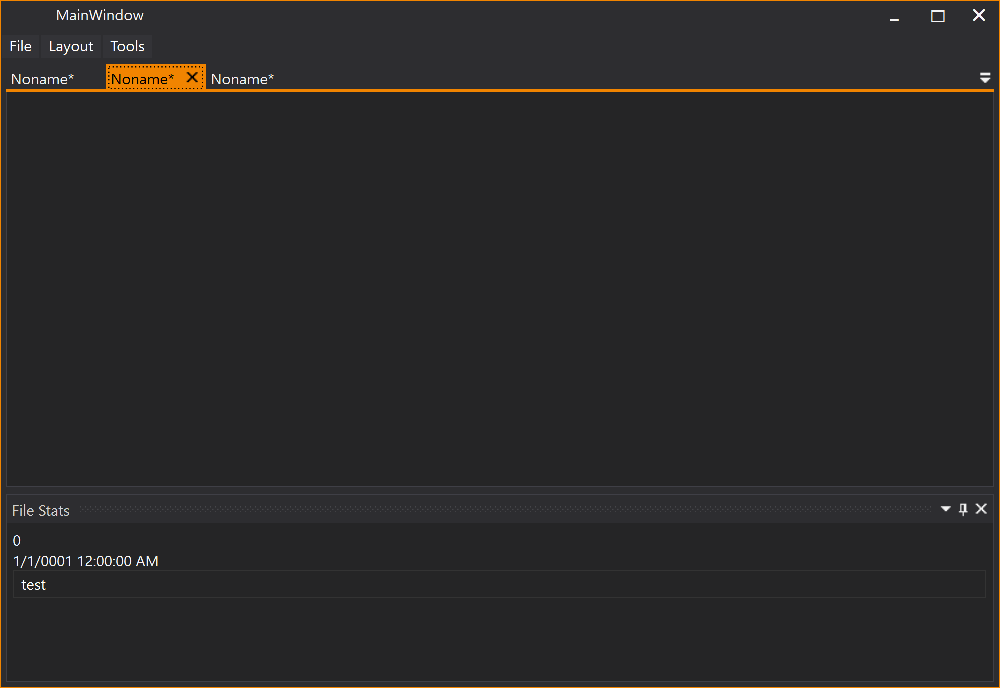 |
 |
| Tool Window |  |
 |
For detailed release notes and version history, see the GitHub Releases page.